---
title: "Forecast Evaluation"
author: ""
abstract: |
Building a model is only half of the forecasting problem. The other half is
knowing whether the forecasts it produces are any good — and knowing this in
a principled way that survives scrutiny. This chapter develops the complete
framework for evaluating forecasts out of sample. We begin by formalising the
distinction between in-sample fit and genuine out-of-sample accuracy, and by
showing why even a model selected by AIC can be beaten by a simpler competitor
on the data that matters: the future. We then introduce loss functions and show
that the choice of loss is not a technicality but a substantive decision that
shapes which forecasts are optimal. The out-of-sample evaluation design —
rolling and recursive windows, horizon choice, look-ahead bias — gives those
loss functions an environment in which to operate honestly. The Diebold-Mariano
test provides a formal procedure for asking whether two competing forecast
sequences differ in accuracy by more than chance. Forecast combination offers
a practical answer when no single model dominates. The chapter closes by
examining what it means to evaluate not just point forecasts but the full
predictive distribution — asking whether stated uncertainty is calibrated
against the uncertainty that actually materialises. Throughout, the running
example is annualised US real GDP growth, comparing an ARIMA(1,1,1) model
against the random walk with drift — the canonical benchmark that serious
forecasters must beat to justify their complexity.
jupyter: python3
format:
html:
toc: true
toc-depth: 3
toc-title: "In this chapter"
number-sections: true
code-fold: true
code-summary: "Show code"
code-tools: true
theme: cosmo
css: styles.css
highlight-style: github
fig-align: center
fig-cap-location: bottom
fig-responsive: true
html-math-method: mathjax
embed-resources: false
execute:
echo: true
warning: false
message: false
cache: false
---
```{python}
#| label: setup
#| include: false
import numpy as np
import pandas as pd
import matplotlib.pyplot as plt
import matplotlib as mpl
import matplotlib.ticker as mticker
from statsmodels.tsa.arima.model import ARIMA
from statsmodels.stats.stattools import durbin_watson
from statsmodels.tsa.stattools import acf
import pandas_datareader.data as web
from scipy.stats import norm as spnorm
from datetime import datetime
import warnings
warnings.filterwarnings("ignore")
# ── EO Brand Palette ───────────────────────────────────────────────────────────
EO_CHARCOAL = "#36454F"
EO_COPPER = "#B87333"
EO_SAGE = "#87A96B"
EO_SKYBLUE = "#5B9BD5"
EO_TERRACOTTA = "#D4745E"
EO_LAVENDER = "#8E7AB5"
EO_COLORS = [EO_COPPER, EO_SKYBLUE, EO_SAGE,
EO_TERRACOTTA, EO_LAVENDER, EO_CHARCOAL]
PAGE_BG = "#FAFAF8"
# ── Global rcParams ────────────────────────────────────────────────────────────
mpl.rcParams.update({
"figure.figsize": (6, 3),
"figure.dpi": 150,
"figure.facecolor": PAGE_BG,
"figure.edgecolor": PAGE_BG,
"axes.facecolor": PAGE_BG,
"axes.edgecolor": EO_CHARCOAL,
"axes.linewidth": 0.7,
"axes.grid": True,
"axes.grid.axis": "y",
"axes.spines.top": False,
"axes.spines.right": False,
"axes.titlesize": 9,
"axes.titleweight": "bold",
"axes.titlecolor": EO_CHARCOAL,
"axes.titlelocation": "left",
"axes.labelsize": 8,
"axes.labelcolor": EO_CHARCOAL,
"axes.labelweight": "normal",
"axes.prop_cycle": mpl.cycler(color=EO_COLORS),
"grid.color": "#E5E5E5",
"grid.linewidth": 0.5,
"grid.linestyle": "--",
"grid.alpha": 0.8,
"xtick.color": EO_CHARCOAL,
"ytick.color": EO_CHARCOAL,
"xtick.labelsize": 7,
"ytick.labelsize": 7,
"xtick.direction": "out",
"ytick.direction": "out",
"xtick.major.size": 3,
"ytick.major.size": 3,
"lines.linewidth": 1.2,
"lines.solid_capstyle": "round",
"legend.frameon": True,
"legend.framealpha": 0.9,
"legend.edgecolor": "#CCCCCC",
"legend.facecolor": PAGE_BG,
"legend.fontsize": 6,
"legend.title_fontsize": 6,
"font.family": "serif",
"font.serif": ["Palatino Linotype", "Palatino", "Georgia",
"DejaVu Serif"],
"font.sans-serif": ["Calibri", "Arial", "DejaVu Sans"],
"font.size": 8,
"text.color": EO_CHARCOAL,
"savefig.dpi": 300,
"savefig.bbox": "tight",
"savefig.facecolor": PAGE_BG,
})
def eo_suptitle(fig, title, **kwargs):
defaults = dict(fontsize=9, fontweight="bold",
color=EO_CHARCOAL, fontfamily="Calibri", y=1.01)
defaults.update(kwargs)
fig.suptitle(title, **defaults)
def eo_style_ax(ax):
for obj in [ax.title, ax.xaxis.label, ax.yaxis.label]:
obj.set_fontfamily("Calibri")
# NBER recession dates (used for shading)
RECESSIONS = [
("1960-04-01", "1961-02-01"),
("1969-12-01", "1970-11-01"),
("1973-11-01", "1975-03-01"),
("1980-01-01", "1980-07-01"),
("1981-07-01", "1982-11-01"),
("1990-07-01", "1991-03-01"),
("2001-03-01", "2001-11-01"),
("2007-12-01", "2009-06-01"),
]
def shade_recessions(ax, start=None, end=None):
for rec_start, rec_end in RECESSIONS:
s, e = pd.Timestamp(rec_start), pd.Timestamp(rec_end)
if start is not None and e < pd.Timestamp(start):
continue
if end is not None and s > pd.Timestamp(end):
continue
ax.axvspan(s, e, color=EO_CHARCOAL, alpha=0.08, lw=0)
```
```{python}
#| label: data-download
#| include: false
#| cache: true
from pathlib import Path
DATA_PATH = Path("../../data/raw")
start = datetime(1947, 1, 1)
end = datetime(2019, 12, 31) # pre-COVID sample throughout
# ── Seasonally adjusted real GDP ───────────────────────────────────────────────
gdp_raw = pd.read_csv(DATA_PATH / "GDPC1.csv", index_col="date", parse_dates=True).loc[str(start):str(end)]
gdp_raw.columns = ["Real GDP"]
# Log level and annualised QoQ growth rate (the forecast target in this chapter)
gdp_raw["Log GDP"] = np.log(gdp_raw["Real GDP"])
gdp_raw["GDP Growth"] = gdp_raw["Log GDP"].diff() * 400 # annualised percent
# Drop first observation (NaN after differencing)
gdp = gdp_raw.dropna().copy()
SAMPLE_START = gdp.index[0].strftime("%Y-%m-%d")
SAMPLE_END = gdp.index[-1].strftime("%Y-%m-%d")
```
::: {.callout-note}
## Learning Objectives
By the end of this chapter, you will be able to:
- Explain the fundamental distinction between in-sample fit and out-of-sample
forecast accuracy, and articulate why a model selected by AIC can still be
beaten by a simpler competitor out of sample
- Define a loss function, state the conditions under which squared error loss
and absolute error loss lead to different optimal forecasts, and select an
appropriate loss function for a given forecasting problem
- Design a valid out-of-sample evaluation exercise: choose an evaluation window,
implement rolling and recursive schemes in Python, and avoid look-ahead bias
- Apply the Diebold-Mariano test to compare two competing forecast sequences,
explain why the long-run variance must account for serial correlation in the
loss differential, and interpret the result correctly
- Implement forecast combination using equal weights and OLS weights, and
explain why combination is often more robust than selecting the single best
model
- Assess the calibration of prediction intervals by checking empirical coverage
and interpreting a probability integral transform histogram
:::
This chapter asks a question that Chapters 3 and 4 conspicuously left open:
once we have a fitted model and a sequence of forecasts, how do we know whether
those forecasts are actually good? We begin with the most important conceptual
distinction in applied forecasting — the gap between fitting and forecasting —
and show why information criteria, despite their theoretical appeal, cannot
fully close it. That motivation leads to the machinery of out-of-sample
evaluation: loss functions that measure errors on the terms that matter, designs
that prevent the future from leaking into the past, and rolling or recursive
windows that trade off stability against data efficiency. With the infrastructure
in place, we build two main tools. The Diebold-Mariano test asks whether two
competing models differ in accuracy by more than sampling variation can explain.
Forecast combination asks whether a mixture of models can outperform any
individual one — and the answer, with striking regularity, is yes. We close by
examining forecast intervals and predictive distributions, asking whether the
uncertainty a model reports is the uncertainty that actually materialises.
Throughout, we work with annualised quarterly US GDP growth and compare an
ARIMA(1,1,1) with drift against the random walk with drift — the benchmark
that professional forecasters are expected to beat before their added complexity
is taken seriously.
## Why In-Sample Fit Is Not Enough {#sec-insample}
### The Overfitting Problem
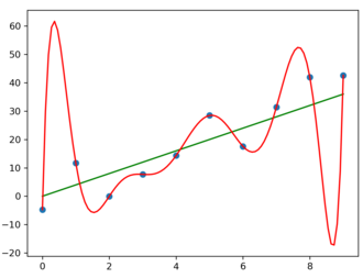
Here is a question worth sitting with: if a model fits the historical data
well — low residuals, high $R^2$, passes every diagnostic — why should we
worry about how it performs on data it has never seen?
The answer is that fitting and forecasting are different tasks, and a model
can excel at one while failing at the other. To see why, suppose we have 100
observations and we add regressors — lags, polynomial terms, dummy variables —
one at a time. With each addition, in-sample fit improves or stays the same:
an extra parameter can always be set to absorb some of the residual variation.
At the limit, a model with 100 parameters fits 100 observations perfectly,
with zero residuals and $R^2 = 1$. But that model has not learned anything
about the process generating the data. It has memorised the sample. Ask it
to forecast the 101st observation and it has nothing to say — its parameters
were tuned to noise, not signal.
This is **[overfitting](https://en.wikipedia.org/wiki/Overfitting)**, and in time series analysis it has a specific
character. Because observations are temporally ordered, a model that captures
features of the training period — a particular recession's shape, a
transitory monetary policy episode, a one-time measurement anomaly — will
embed those features in its parameter estimates. When the forecast period
arrives, those features are absent, and the model's built-in expectations
become liabilities rather than assets. The more tightly a model is fitted to
one historical regime, the more it may struggle in a new one.
The time series version of this problem is also harder to detect than the
cross-sectional version. In a regression with an independent test set, the
damage from overfitting is visible immediately: in-sample $R^2$ is high,
out-of-sample $R^2$ is low or negative. In time series, the test set is the
future, and we only observe it once. We cannot repeat the experiment with a
different sample draw. This makes principled evaluation design — choosing
evaluation windows carefully, committing to them in advance, and respecting
the temporal boundary between estimation and evaluation — not merely good
practice but the only protection available.
{#fig-overfitting width="55%"}
### Information Criteria as Partial Solutions
Chapters 3 and 4 introduced the Akaike Information Criterion (AIC) and the
Bayesian Information Criterion (BIC) as tools for choosing between model
specifications. Both impose a penalty on log-likelihood for the number of
estimated parameters, discouraging the kind of unrestricted complexity that
drives overfitting. They are partial solutions to the problem raised in the
previous section — and the word "partial" deserves emphasis.
The AIC has a precise theoretical motivation. Under regularity conditions,
minimising AIC is equivalent to selecting the model that is, on average across
all possible samples of size $T$, closest to the true data-generating process
in the sense of predictive likelihood. This is not in-sample fit. It is a
criterion that explicitly accounts for the cost of parameter estimation by
penalising complexity — the penalty term $2k$ (where $k$ is the number of
parameters) is an approximately unbiased correction for the optimism that
arises when the same data are used to both estimate and evaluate a model.
The BIC has a different motivation — it approximates the log marginal
likelihood of the data under a flat prior, and it selects the model that would
be chosen by a Bayesian model comparison with large samples — but its practical
effect is similar: a larger penalty per parameter than AIC, biased toward
parsimony, consistent for the true model order when the true order is finite.
Why, then, is this only a partial solution? Three reasons.
First, AIC and BIC measure expected predictive accuracy in terms of
log-likelihood — which corresponds to the logarithmic loss function. If we
care about a different loss function, such as mean squared error or mean
absolute error, minimising AIC does not guarantee that we minimise expected
out-of-sample loss under that criterion. A model selected by AIC may not be
the one with the lowest RMSE on the evaluation period.
Second, both criteria are calculated on the full in-sample period. They account
for the cost of estimation, but they cannot account for **structural change** —
the possibility that the process generating the data in the evaluation period
differs from the process in the estimation period. A model that is best for
the history may not be best for the future if the economy has shifted.
Third, and most practically, AIC and BIC are tools for specification within a
model family. They can tell us whether an ARIMA(2,1,1) is preferred to an
ARIMA(1,1,1) given the data. They cannot tell us whether either model beats
an entirely different approach — a simple random walk, a judgment-based
forecast, a machine learning model — on the horizon and loss function that
matter for the actual decision at hand. For that comparison, we need
out-of-sample evaluation.
::: {.callout-note icon=false}
## What AIC Is Really Minimising
The formal criterion AIC approximates is the **Kullback-Leibler (KL)
divergence** — a measure of how much information is lost when the fitted
model $\hat{f}$ is used in place of the true data-generating process $f$:
$$\text{KL}(f \| \hat{f}) = \int f(y) \log \frac{f(y)}{\hat{f}(y)}\, dy$$
A smaller KL divergence means the fitted model is a better approximation to
the truth in terms of predictive probability. Selecting the model with the
lowest AIC is equivalent, asymptotically, to selecting the model with the
smallest expected KL divergence from the truth. This is why AIC has a
genuine claim to being a predictive criterion rather than merely a
goodness-of-fit measure. It is also why it corresponds specifically to
log-likelihood loss: the KL divergence and the logarithmic scoring rule are
the same object expressed in different notation.
:::
::: {.callout-note icon=false}
## The Core Distinction
**In-sample fit** measures how well a model explains the data it was estimated
on. It is a measure of the model's description of the past.
**Out-of-sample forecast accuracy** measures how well a model predicts data
it has never seen, on a horizon and loss function chosen by the forecaster.
It is a measure of the model's usefulness for the future.
Information criteria bridge these two concepts in a specific, limited sense:
they penalise in-sample fit for parameter complexity to approximate expected
out-of-sample predictive likelihood. But they are not a substitute for direct
out-of-sample evaluation when the goal is to compare competing forecast
strategies on a specific task.
:::
This distinction is what motivates everything that follows. The tools in this
chapter — loss functions, evaluation designs, the [Diebold-Mariano test](https://en.wikipedia.org/wiki/Mean_absolute_scaled_error),
forecast combination, interval calibration checks — are all ways of asking
the same underlying question: how useful is this model for predicting the
future, on the terms that the future will actually be judged?
## Loss Functions and Forecast Errors {#sec-loss}
### What Is a Forecast Error?
Before we can measure accuracy, we need to agree on what we are measuring.
The starting point is the **[forecast error](https://en.wikipedia.org/wiki/Forecast_error)**: the gap between what the model
predicted and what actually happened.
Suppose we are standing at time $t$ and want to forecast the value of $y$ at
time $t + h$, where $h$ is the **forecast horizon** — one quarter ahead, four
quarters ahead, and so on. The forecast we form at time $t$ for horizon $h$
is $\hat{y}_{t+h|t}$, read as "the forecast of $y$ at $t+h$, made at time
$t$." When $t + h$ arrives and we observe the actual value $y_{t+h}$, the
forecast error is:
$$e_{t+h|t} = y_{t+h} - \hat{y}_{t+h|t} \tag{5.1}$$
A positive error means we underpredicted; a negative error means we
overpredicted. The sign matters for some purposes — a central bank that
underpredicts inflation faces a different policy problem than one that
overpredicts it — but for the basic summary statistics of forecast accuracy,
what we care about is the **magnitude** of the error, not its sign.
The double subscript in $e_{t+h|t}$ is standard notation in the forecasting
literature and worth reading carefully. The index before the vertical bar,
$t + h$, identifies the period being forecast — the target date. The index
after the vertical bar, $t$, identifies the **forecast origin** — the date
at which the forecast was made and the information set was closed. So
$e_{t+4|t}$ is the error of a four-quarter-ahead forecast made at time $t$,
and $e_{t+1|t}$ is the one-quarter-ahead error made at the same origin. This
distinction matters because forecasts made further in advance are generally
less accurate, and we should evaluate them separately rather than pooling
across horizons.
When we run a systematic evaluation over a window of time, we let the forecast
origin $t$ advance period by period, each time refitting or updating the model
and recording a new error. The standard convention — followed throughout this
chapter — is to index the $n$ evaluation periods by the forecast origin: origins
run from $T_0$ to $T_0 + n - 1$, so that the last origin is $T_0 + n - 1$ and
the last realisation we need to observe is $T_0 + n - 1 + h$. For each origin
$t$ we form a forecast $\hat{y}_{t+h|t}$ and, once period $t+h$ arrives, record
the error. The full sequence is:
$$\{e_{t+h|t}\}_{t=T_0}^{T_0+n-1} \tag{5.1b}$$
This notation keeps $n$ — the number of evaluation periods — as the single
design parameter to specify, avoiding the ambiguity that arises from indexing
both endpoints independently. The sequence is the raw material for every
accuracy measure and every formal test in this chapter.
A concrete example resolves any remaining ambiguity. Suppose $T_0 =
\text{1990 Q1}$, the evaluation window has $n = 4$ origins, and the horizon
is $h = 1$ quarter. The four forecast origins, their target quarters, and
the errors are:
| Origin $t$ | Forecast made | Forecast target $t+h$ | Realisation observed | Error $e_{t+1|t}$ |
|:----------:|:-------------:|:--------------------:|:--------------------:|:-----------------:|
| 1990 Q1 | end of 1990 Q1 | 1990 Q2 | 1990 Q2 | $y_{\text{Q2}} - \hat{y}_{\text{Q2}|\text{Q1}}$ |
| 1990 Q2 | end of 1990 Q2 | 1990 Q3 | 1990 Q3 | $y_{\text{Q3}} - \hat{y}_{\text{Q3}|\text{Q2}}$ |
| 1990 Q3 | end of 1990 Q3 | 1990 Q4 | 1990 Q4 | $y_{\text{Q4}} - \hat{y}_{\text{Q4}|\text{Q3}}$ |
| 1990 Q4 | end of 1990 Q4 | 1991 Q1 | 1991 Q1 | $y_{\text{Q1}} - \hat{y}_{\text{Q1}|\text{Q4}}$ |
The last origin is $T_0 + n - 1 = \text{1990 Q4}$, and the last observation
we need — the realisation of the final forecast — is $T_0 + n - 1 + h =
\text{1991 Q1}$. The evaluation period itself runs through 1990; we simply
need one extra quarter of data to score the last forecast. Repeating the same
logic at $h = 4$ with the same $T_0$ and $n$: the last origin is still 1990
Q4, but the last realisation needed is 1991 Q4 — four quarters later. Longer
horizons push the data requirement further into the future without changing
the set of forecast origins, which is exactly why accuracy should always be
reported separately by horizon.
### Symmetric Loss: MSE, RMSE, and MAE
The simplest way to summarise a sequence of forecast errors is to average some
function of them. The function we choose is the **[loss function](https://en.wikipedia.org/wiki/Loss_function)**, and the
choice is consequential.
The two most common choices for symmetric loss — where errors of equal
magnitude in either direction are penalised equally — are the **[mean squared
error](https://en.wikipedia.org/wiki/Mean_squared_error)** (MSE) and the **[mean absolute error](https://en.wikipedia.org/wiki/Mean_absolute_error)** (MAE).
$$\text{MSE} = \frac{1}{n} \sum_{t=T_0}^{T_0+n-1} e_{t+h|t}^2 \tag{5.2}$$
$$\text{MAE} = \frac{1}{n} \sum_{t=T_0}^{T_0+n-1} |e_{t+h|t}| \tag{5.3}$$
where $n$ is the number of forecast origins in the evaluation window. The
**[root mean squared error](https://en.wikipedia.org/wiki/Root_mean_square_deviation)** (RMSE) is simply $\sqrt{\text{MSE}}$, which
returns the loss to the same units as the original series and is often easier
to interpret.
The difference between MSE and MAE is not just algebraic — it reflects
different underlying preferences about the cost of forecast errors.
MSE penalises large errors disproportionately. An error of 4 percentage points
contributes 16 to the MSE; an error of 2 percentage points contributes only 4.
This means that under MSE, a forecaster who makes occasional very large errors
will be penalised much more heavily than one who makes consistently moderate
ones, even if the moderate errors add up to the same total absolute value. MSE
is the right criterion when large errors are genuinely much worse than small
ones — when a severe miss causes damage that is more than proportional to its
size.
MAE weights all errors in proportion to their magnitude. An error of 4
contributes twice as much as an error of 2, nothing more. MAE is more robust
to outliers and is the right criterion when the cost of an error scales
linearly with its size.
These preferences have a deeper consequence for what the **optimal forecast**
is. It can be shown that:
::: {.callout-note icon=false}
## Optimal Forecasts Under Different Loss Functions
Under **squared error loss**, the optimal forecast is the **conditional mean**:
$$\hat{y}_{t+h|t}^* = \mathbb{E}[y_{t+h} \mid \mathcal{F}_t] \tag{5.4}$$
Under **absolute error loss**, the optimal forecast is the **conditional
median**:
$$\hat{y}_{t+h|t}^* = \text{Median}[y_{t+h} \mid \mathcal{F}_t] \tag{5.5}$$
For symmetric forecast distributions — such as the Gaussian distribution
implied by ARMA/ARIMA models — the mean and the median coincide, so the
distinction does not matter in practice. For skewed distributions (asset
returns, insurance claims, default probabilities), the choice of loss function
can lead to materially different optimal forecasts.
:::
We established in Chapter 1 that the optimal point forecast under squared
error loss is the conditional mean. That result was stated without proof as a
foundational fact. Here we can see exactly why it matters: the choice of MSE
as an evaluation criterion is not neutral. It implicitly commits us to judging
forecasters by how well they approximate the conditional mean. If the true
costs in a given application are better described by absolute error — or by
some asymmetric function — then using MSE as the evaluation criterion may rank
forecasters in the wrong order.
### Scale-Free Loss: MAPE and MASE
MSE and MAE are scale-dependent: a GDP forecast with MAE of 0.5 percentage
points and an inflation forecast with MAE of 0.5 percentage points are directly
comparable because they are already in the same units. But comparing the MAE
of a quarterly GDP growth forecast with the MAE of a weekly jobless claims
forecast is meaningless — the series have entirely different scales and
variability.
Two scale-free alternatives address this.
The **[mean absolute percentage error](https://en.wikipedia.org/wiki/Mean_absolute_percentage_error)** (MAPE) expresses each error as a
percentage of the actual value:
$$\text{MAPE} = \frac{1}{n} \sum_{t=T_0}^{T_0+n-1}
\left| \frac{e_{t+h|t}}{y_{t+h}} \right| \times 100 \tag{5.6}$$
MAPE is intuitive and widely reported, but it has a serious pathology.
::: {.callout-warning icon=false}
## MAPE Near Zero
MAPE is undefined when $y_{t+h} = 0$ and becomes extremely large and
unstable when $y_{t+h}$ is close to zero. For GDP growth, which can take
values near zero during slowdowns and negative values in recessions, MAPE
can produce wildly misleading rankings — penalising a forecast of $-0.1$
when the actual is $0.1$ far more than a forecast of $3.0$ when the actual
is $3.2$, despite the second error being twenty times larger in absolute
terms. Handle with care on any series that crosses zero.
:::
The **[mean absolute scaled error](https://en.wikipedia.org/wiki/Mean_absolute_scaled_error)** (MASE), introduced by Hyndman and Koehler
(2006), avoids this problem by expressing forecast errors relative to how
large errors would have been under the simplest conceivable benchmark: the
**naïve random walk**, which predicts that the next observation will equal the
current one. If our model cannot beat a strategy of "tomorrow will look like
today," it has no practical value. The in-sample average absolute error of
that naïve strategy — computed over the training period of length $T$ — gives
us a natural scale for the series:
$$\text{MASE} = \frac{\text{MAE}}
{\dfrac{1}{T-1}\displaystyle\sum_{t=2}^{T} |y_t - y_{t-1}|} \tag{5.7}$$
The denominator deserves a close look. Each term $|y_t - y_{t-1}|$ is the
absolute error the naïve random walk would have made at time $t$: it predicted
$y_{t-1}$ and the actual was $y_t$. Averaging these over the in-sample period
gives the typical error magnitude for that benchmark on this particular series.
Note that these are all **observed values** — no model is being estimated in
the denominator, which is why no hats appear. Dividing the out-of-sample MAE
of our candidate model by this in-sample scale tells us how the model compares
to the naïve benchmark, in units that are meaningful for the series at hand.
A MASE below 1 means the model beats the naïve benchmark on average; a MASE
above 1 means it does not. MASE is well-defined for any series regardless of
whether values are near zero, and it is our recommended scale-free criterion
for comparisons across series with different units or volatility levels.
### Asymmetric Loss
Every loss function we have discussed so far is symmetric: an overforecast of
2 percentage points and an underforecast of 2 percentage points are penalised
equally. For many real forecasting problems, this symmetry is wrong.
Consider a central bank tasked with keeping inflation near a 2 percent target.
Undershooting the inflation target — forecasting too-high inflation and
tightening policy unnecessarily — produces a recession. Overshooting —
forecasting too-low inflation and failing to tighten in time — produces an
inflation spiral. These costs are not symmetric. The appropriate loss function
should reflect the relative severity of the two errors.
Or consider a firm managing inventory. An underforecast of demand leads to
stockouts and lost sales. An overforecast leads to excess inventory and
carrying costs. The ratio of these costs — which varies by industry, product
perishability, and margin structure — should determine the shape of the loss
function.
The general form of an asymmetric loss function assigns different slopes to
positive and negative errors:
$$\mathcal{L}(e) = \begin{cases}
\alpha \cdot |e| & \text{if } e < 0 \quad (\text{overprediction}) \\
(1-\alpha) \cdot |e| & \text{if } e \geq 0 \quad (\text{underprediction})
\end{cases} \tag{5.8}$$
where $\alpha \in (0,1)$ determines the asymmetry. When $\alpha = 0.5$, this
reduces to the standard MAE. When $\alpha > 0.5$, overprediction is penalised
more heavily; when $\alpha < 0.5$, underprediction bears the higher cost.
In this context, asymmetric loss is primarily a conceptual tool. It reminds
us that the choice of evaluation criterion is a substantive decision, not a
default. In the empirical applications that follow, we use RMSE as our primary
criterion — it is the standard in macroeconomic forecasting, it facilitates
comparison with published benchmarks, and GDP growth is a series where the
symmetric assumption is a reasonable starting point. But the principle that
loss functions encode preferences — and that a forecast optimal under one
criterion may be suboptimal under another — is one we carry forward.
### Loss Functions in Python: A First Look at the Data
Before building the full evaluation machinery in the next section, it is
useful to look at the series we will be forecasting and develop some intuition
about what "good" accuracy means in this context.
```{python}
#| label: fig-gdp-growth
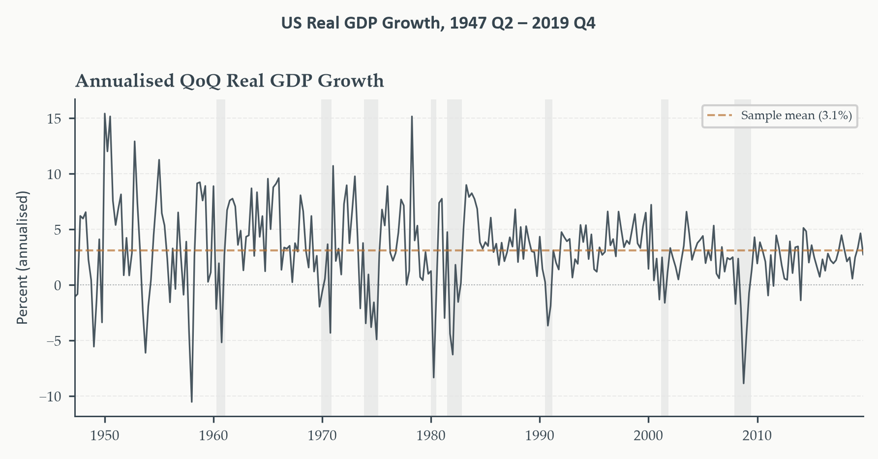
#| fig-cap: "Annualised quarterly US real GDP growth, 1947 Q2 – 2019 Q4
#| (pre-COVID sample). Shaded regions are NBER recessions. The series
#| fluctuates around a mean of roughly 3 percent, with pronounced
#| negative episodes during recessions and sharp recoveries immediately
#| after. Volatility is not constant — the pre-1985 period is visibly
#| more turbulent than the Great Moderation era that follows — a feature
#| that bears on the evaluation design in Section 5.3."
#| fig-width: 6
#| fig-height: 3
#| code-fold: true
#| code-summary: "Show code — GDP growth series"
fig, ax = plt.subplots(figsize=(6, 3))

ax.plot(gdp.index, gdp["GDP Growth"],
        color=EO_CHARCOAL, lw=0.8, alpha=0.9)
ax.axhline(gdp["GDP Growth"].mean(), color=EO_COPPER,
           lw=1.0, ls="--", alpha=0.7, label=f"Sample mean ({gdp['GDP Growth'].mean():.1f}%)")
ax.axhline(0, color=EO_CHARCOAL, lw=0.5, ls=":", alpha=0.4)

shade_recessions(ax, start=SAMPLE_START, end=SAMPLE_END)

ax.set_xlim(gdp.index[0], gdp.index[-1])
ax.set_ylabel("Percent (annualised)")
ax.set_title("Annualised QoQ Real GDP Growth")
ax.legend(fontsize=6)
eo_style_ax(ax)
eo_suptitle(fig, f"US Real GDP Growth, {gdp.index[0].year} Q2 – {gdp.index[-1].year} Q4")
fig.tight_layout()
plt.show()
```
The series has a sample mean of `{python} f"{gdp['GDP Growth'].mean():.2f}"` percent
and a standard deviation of `{python} f"{gdp['GDP Growth'].std():.2f}"` percent.
A naïve forecast that always predicts the sample mean would produce an RMSE
equal to that standard deviation — roughly `{python} f"{gdp['GDP Growth'].std():.1f}"`
percentage points. Any model that cannot beat this benchmark is not useful. The
question this chapter develops the tools to answer is whether an ARIMA model
beats not just the sample mean but the more demanding benchmark of the random
walk with drift — a model that predicts next quarter's growth will equal this
quarter's growth plus a constant. As we will see, that is a harder target than
it sounds.
```{python}
#| label: tbl-loss-illustration
#| code-fold: true
#| code-summary: "Show code — loss function illustration"
# Illustrate how MSE, MAE, and RMSE respond differently to error magnitude
errors = np.array([-4, -2, -1, 0, 1, 2, 4], dtype=float)

print("Loss function comparison — how different criteria penalise errors")
print("─" * 60)
print(f"{'Error':>8}  {'Squared':>10}  {'Absolute':>10}  {'Asymm α=0.3':>12}")
print("─" * 60)
for e in errors:
    sq  = e**2
    ab  = abs(e)
    asy = 0.3 * abs(e) if e < 0 else 0.7 * abs(e)
    print(f"{e:>8.1f}  {sq:>10.1f}  {ab:>10.1f}  {asy:>12.1f}")
print("─" * 60)
print()
print("MSE weights large errors heavily (4² = 16 vs 2² = 4).")
print("MAE weights all errors proportionally (|4| = 2×|2|).")
print("Asymm (α=0.3): underprediction (e>0) penalised 0.7×|e|,")
print("               overprediction  (e<0) penalised 0.3×|e|.")
```
*The table illustrates how the three loss families respond to the same set of
errors. MSE assigns four times the weight to an error of 4 that it assigns to
an error of 2; MAE assigns exactly twice; asymmetric loss (here with $\alpha =
0.3$) additionally charges different rates depending on the direction of the
miss. The choice between these criteria is not a technicality — it determines
which forecast sequences look best and, through the optimality results above,
which model is theoretically preferred.*
## Out-of-Sample Evaluation Design {#sec-oos}
### The Problem with a Single Train-Test Split
Chapter 2 introduced a simple train-test exercise: fit the model on the first
portion of the data, forecast the rest, and compare. That exercise was useful
as a first illustration, but it has a structural weakness that becomes clear
once we think carefully about what we are trying to measure.
A single split produces a single sequence of errors over a single evaluation
period. If that period happens to contain an unusual episode — a recession, a
policy shift, an external shock — the performance number we compute reflects
conditions that may be unrepresentative of the model's typical behaviour. We
have one draw from a distribution we care about, and one draw is a fragile
basis for inference.
The deeper problem is **look-ahead bias**: the inadvertent use of future
information in building the model or selecting its parameters. This is the
most common methodological error in applied forecast evaluation, and it takes
forms that are not always obvious. The clearest case is straightforward:
fitting a model on the full sample and then claiming to evaluate it on a
subset of that same sample. The model has already seen the evaluation period;
its parameters have been influenced by the data it is supposedly being tested
on. The errors we compute are in-sample errors dressed up as out-of-sample
ones.
::: {.callout-warning icon=false}
## Look-Ahead Bias: Forms to Watch For
**Direct form:** Estimating the model on the full sample and evaluating on a
subsample. The evaluation period is inside the estimation sample.
**Indirect form:** Using the full sample to select the model — choosing the
ARIMA order, deciding whether to include a trend, setting the window length —
and then evaluating on a hold-out period. Model selection has already
consumed information from the test set.
**Data-processing form:** Applying transformations (seasonal adjustment,
outlier correction, normalisation based on the full sample) before splitting.
The transformation itself carries forward information that a genuine real-time
forecaster would not have had.
In all cases, the fix is the same: treat the evaluation period as strictly
out of bounds during every step of model construction. A forecast made at
time $t$ must use only information available at time $t$.
:::
### Rolling and Recursive Windows
The standard solution is to replace the single split with a **pseudo-real-time
evaluation** in which we simulate what a forecaster would have done at each
point in the evaluation period. We fix a forecast horizon $h$ and a training
window, then step through the evaluation period one observation at a time,
re-estimating the model at each step and producing a new forecast. The result
is a sequence of errors generated under the same discipline a real forecaster
faces: no future data, no benefit of hindsight.
There are two schemes for updating the estimation window.
In a **rolling window** scheme, the window has a fixed length $W$. At each
forecast origin $t$, we estimate on observations $t - W + 1$ through $t$ and
forecast period $t + h$. As $t$ advances, the window moves forward, dropping
the oldest observation and adding the newest. This scheme weights recent data
equally and older data not at all — a sensible choice if there is reason to
believe the process has changed over time and recent observations are more
informative about the current regime.
In a **recursive** (expanding window) scheme, the window grows with each step.
At origin $t$, we estimate on all observations from the beginning of the
sample through $t$. The window never drops observations, so the parameter
estimates become more precise as $t$ advances. This scheme is efficient when
the process is stable — it uses all available information — but it dilutes the
influence of recent data as the sample grows, which can be a liability if the
process has shifted.
::: {.callout-note icon=false}
## Rolling vs. Recursive: The Core Trade-off
| | Rolling window | Recursive window |
|:---|:---|:---|
| Window length | Fixed at $W$ | Grows with each step |
| Oldest obs. used | $t - W + 1$ | Always 1 |
| Adapts to change | Yes — old data dropped | Slowly — old data retained |
| Parameter precision | Lower (fewer obs.) | Higher (more obs.) |
| Best when | Process may be unstable | Process is stable |
In practice, both schemes are worth running. Large differences between them
are informative: if the rolling window substantially outperforms the recursive
one, it suggests the process has changed over the sample and recent data are
more relevant than old data. Chapter 6 develops formal tests for exactly this
kind of instability.
:::
### Choosing the Horizon and Window Length
How long should the evaluation window be, and which horizon should we target?
Neither question has a universal answer, but both have principled
considerations.
**Horizon choice** should reflect the actual decision context. A central bank
forecasting inflation for the next policy meeting cares about $h = 1$ or
$h = 2$ quarters. A fiscal authority planning a multi-year budget cares about
$h = 8$ or longer. For academic benchmarking of macroeconomic models, $h \in
\{1, 2, 4, 8\}$ quarters is conventional. Because accuracy degrades with
horizon, results at different horizons should be reported separately, not
averaged. In our GDP growth application we focus on $h = 1$ and $h = 4$ —
the near-term and medium-term horizons of most practical relevance.
**Window length** involves a bias-variance trade-off. A short rolling window
adapts quickly to structural change but produces noisy parameter estimates
with high variance. A long window produces precise estimates but is slow to
update when the process shifts. For quarterly macro series, windows of 40 to
60 quarters (ten to fifteen years) are common starting points. We use a
rolling window of 40 quarters — ten years of training data at each origin —
which keeps the window long enough for stable ARIMA estimation while remaining
short enough to track the Great Moderation shift in volatility visible in
Figure 5.1.
A practical note on evaluation sample length: the Diebold-Mariano test
developed in Section 5.4 requires enough errors to estimate the long-run
variance of the loss differential reliably. With quarterly data, an evaluation
period of at least 40 observations is a reasonable minimum; ours comfortably
exceeds this.
### The Evaluation Loop in Python
With these design choices fixed, the Python implementation is a
straightforward loop. At each forecast origin $t$, we slice the training
data, fit both models — ARIMA(1,1,1) with drift and the random walk with
drift — produce one-step-ahead and four-step-ahead forecasts, and store the
errors. Both models and both horizons are handled in a single pass; the error
sequences produced here are used directly in Section 5.4 and Section 5.5.
```{python}
#| label: eval-loop
#| code-fold: true
#| code-summary: "Show code — rolling evaluation loop"
# ── Evaluation design ─────────────────────────────────────────────────────────
WINDOW   = 40      # rolling training window (quarters)
H_SHORT  = 1       # near-term horizon
H_LONG   = 4       # medium-term horizon

y_growth = gdp["GDP Growth"].copy()   # annualised QoQ growth (forecast target)
y_level  = gdp["Log GDP"].copy()      # log level (used for ARIMA fitting)

T = len(y_level)

# Evaluation origins: need at least H_LONG periods remaining after each origin
eval_origins = range(WINDOW - 1, T - H_LONG)

# ── Storage ───────────────────────────────────────────────────────────────────
# Errors (used by Sections 5.4 and 5.5)
errors_arima = {H_SHORT: [], H_LONG: []}
errors_rw    = {H_SHORT: [], H_LONG: []}

# Distributional objects (used by Section 5.6 — stored here to avoid
# re-running estimation a second and third time)
fc_mean_arima = {H_SHORT: [], H_LONG: []}   # point forecast (growth scale)
fc_se_arima   = {H_SHORT: [], H_LONG: []}   # forecast SE   (growth scale)
fc_ci_arima   = {0.10: {H_SHORT: [], H_LONG: []},
                 0.05: {H_SHORT: [], H_LONG: []}}   # interval bounds

origins_used = []
n_failures   = 0

for t in eval_origins:
    # Rolling window: observations [t - WINDOW + 1, ..., t]
    train_level  = y_level.iloc[t - WINDOW + 1 : t + 1]
    train_growth = y_growth.iloc[t - WINDOW + 1 : t + 1]
    last_lvl     = train_level.iloc[-1]

    # ── ARIMA(1,1,1) with drift ───────────────────────────────────────────────
    # trend="t" adds a linear trend in levels, which becomes a constant (drift)
    # in the first-differenced equation — the correct specification for ARIMA
    # with d=1. statsmodels rejects trend="c" for d>=1 in recent versions.
    try:
        mod_arima = ARIMA(train_level, order=(1, 1, 1), trend="t")
        res_arima = mod_arima.fit()

        for h in [H_SHORT, H_LONG]:
            fc_obj   = res_arima.get_forecast(steps=h)
            # Point forecast and SE on growth-rate scale
            fm_lvl   = fc_obj.predicted_mean.iloc[-1]
            fs_lvl   = np.sqrt(fc_obj.var_pred_mean.iloc[-1])
            fm_g     = (fm_lvl - last_lvl) * 400 / h
            fs_g     = fs_lvl * 400 / h

            actual   = y_growth.iloc[t + h]
            errors_arima[h].append(actual - fm_g)
            fc_mean_arima[h].append(fm_g)
            fc_se_arima[h].append(fs_g)

            # Prediction interval bounds on growth-rate scale
            for a in [0.10, 0.05]:
                ci = fc_obj.conf_int(alpha=a)
                lo_g = (ci.iloc[-1, 0] - last_lvl) * 400 / h
                hi_g = (ci.iloc[-1, 1] - last_lvl) * 400 / h
                fc_ci_arima[a][h].append((lo_g, hi_g))

    except Exception:
        n_failures += 1
        for h in [H_SHORT, H_LONG]:
            errors_arima[h].append(np.nan)
            fc_mean_arima[h].append(np.nan)
            fc_se_arima[h].append(np.nan)
            for a in [0.10, 0.05]:
                fc_ci_arima[a][h].append((np.nan, np.nan))

    # ── Random walk with drift ────────────────────────────────────────────────
    # Drift = mean annualised growth over the training window.
    # The h-step RW forecast of annualised growth is the drift regardless of h.
    drift = train_growth.mean()
    for h in [H_SHORT, H_LONG]:
        errors_rw[h].append(y_growth.iloc[t + h] - drift)

    origins_used.append(y_level.index[t])

if n_failures > 0:
    print(f"Warning: {n_failures} ARIMA fit failures (NaN inserted).")

# Convert to Series
for h in [H_SHORT, H_LONG]:
    errors_arima[h]   = pd.Series(errors_arima[h],   index=origins_used, name="ARIMA")
    errors_rw[h]      = pd.Series(errors_rw[h],       index=origins_used, name="RW")
    fc_mean_arima[h]  = pd.Series(fc_mean_arima[h],   index=origins_used)
    fc_se_arima[h]    = pd.Series(fc_se_arima[h],     index=origins_used)

# Drop NaNs (failed ARIMA fits) consistently across all stored objects
origins_arr = np.array(origins_used)   # numpy array supports boolean indexing
for h in [H_SHORT, H_LONG]:
    mask = (errors_arima[h].notna() & errors_rw[h].notna()).values
    errors_arima[h]  = errors_arima[h].iloc[mask]
    errors_rw[h]     = errors_rw[h].iloc[mask]
    fc_mean_arima[h] = fc_mean_arima[h].iloc[mask]
    fc_se_arima[h]   = fc_se_arima[h].iloc[mask]
    for a in [0.10, 0.05]:
        ci_arr = np.array(fc_ci_arima[a][h])   # shape (n, 2)
        fc_ci_arima[a][h] = pd.DataFrame(
            ci_arr[mask], index=origins_arr[mask], columns=["lo", "hi"]
        )

# Align origins_used to the filtered index
origins_used = list(errors_arima[H_SHORT].index)

n_eval = len(errors_arima[H_SHORT])
print(f"Evaluation window: "
      f"{origins_used[0].strftime('%Y-%m')} – {origins_used[-1].strftime('%Y-%m')}")
print(f"Valid evaluation origins: {n_eval}")
print(f"Horizons: h = {H_SHORT} and h = {H_LONG} quarters")
```
```{python}
#| label: tbl-rmse
#| code-fold: true
#| code-summary: "Show code — RMSE summary table"
def rmse(e): return np.sqrt(np.mean(e.values**2))
def mae_fn(e):  return np.mean(np.abs(e.values))

print("Out-of-sample forecast accuracy — annualised GDP growth (pp)")
print("Rolling window: 40 quarters  |  Pre-COVID sample")
print("═" * 56)
print(f"{'Model':22}  {'RMSE h=1':>10}  {'RMSE h=4':>10}")
print("─" * 56)
for label, errs in [("ARIMA(1,1,1)+drift", errors_arima),
                    ("RW with drift",       errors_rw)]:
    r1 = rmse(errs[H_SHORT])
    r4 = rmse(errs[H_LONG])
    print(f"{label:22}  {r1:>10.3f}  {r4:>10.3f}")
print("─" * 56)
ratio_h1 = rmse(errors_arima[H_SHORT]) / rmse(errors_rw[H_SHORT])
ratio_h4 = rmse(errors_arima[H_LONG])  / rmse(errors_rw[H_LONG])
print(f"{'RMSE ratio (ARIMA/RW)':22}  {ratio_h1:>10.3f}  {ratio_h4:>10.3f}")
print("═" * 56)
print("RMSE in annualised percentage points.")
print("Ratio < 1 → ARIMA beats random walk on this metric.")
```
*RMSE for both models at horizons $h = 1$ and $h = 4$. The RMSE ratio
(ARIMA divided by RW) in the final row is the key comparison: a value below
1 means the ARIMA is more accurate; a value above 1 means the random walk
wins. The table tells us the direction and magnitude of the difference;
Section 5.4 asks whether it is statistically distinguishable from zero.*
```{python}
#| label: fig-errors
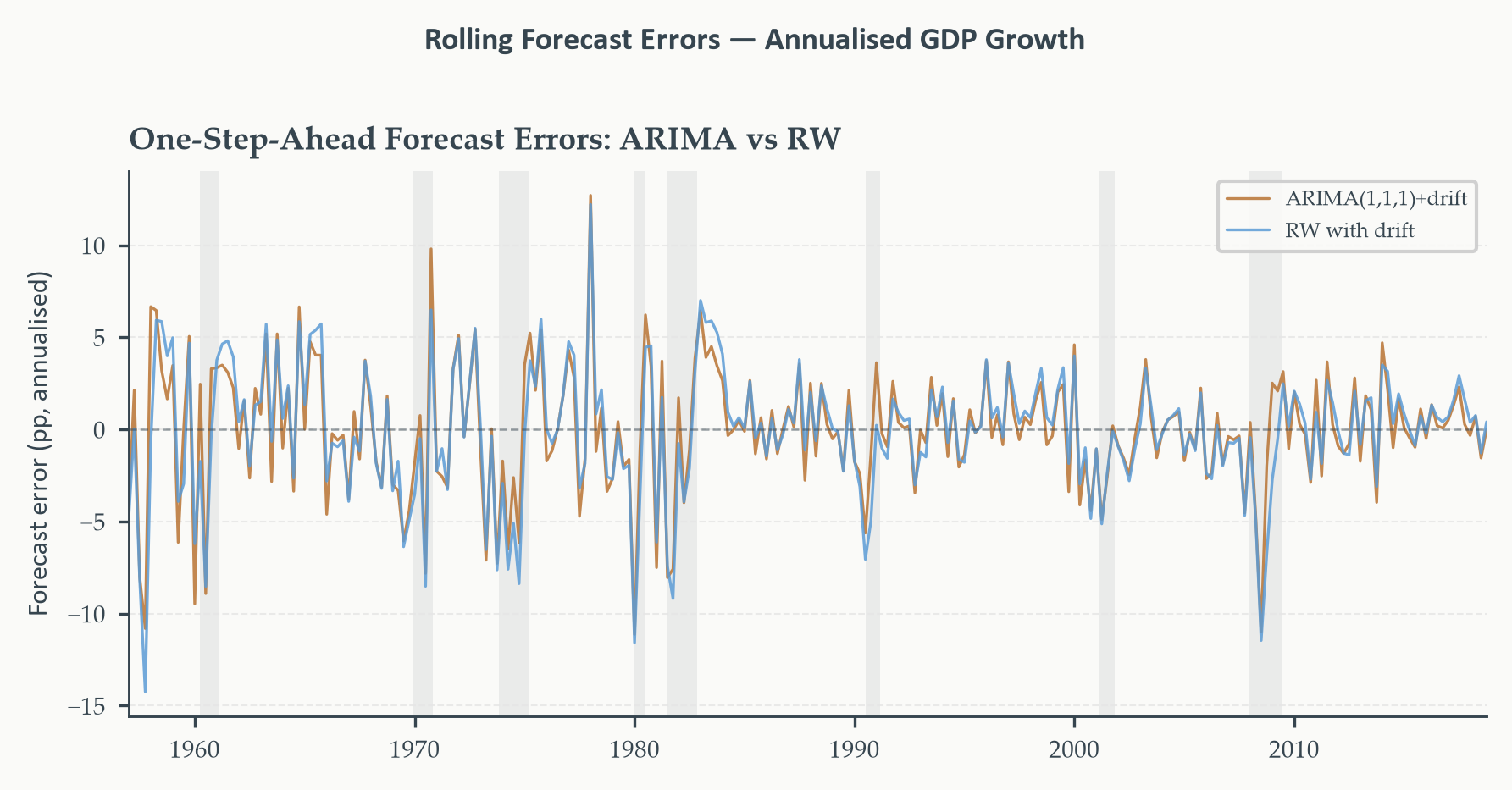
#| fig-cap: "Rolling one-step-ahead forecast errors for the ARIMA(1,1,1)
#| with drift (copper) and the random walk with drift (sky blue),
#| annualised GDP growth, pre-COVID sample. Both sequences are centred
#| near zero. Large errors cluster around NBER recessions (shaded),
#| reflecting the difficulty of forecasting turning points. The question
#| is not whether either model makes large errors during recessions —
#| they both do — but whether the ARIMA's errors are systematically
#| smaller across the full evaluation period."
#| fig-width: 6
#| fig-height: 3
#| code-fold: true
#| code-summary: "Show code — forecast error plot"
fig, ax = plt.subplots(figsize=(6, 3))

ax.plot(errors_arima[H_SHORT].index, errors_arima[H_SHORT].values,
        color=EO_COPPER,   lw=0.8, alpha=0.85, label="ARIMA(1,1,1)+drift")
ax.plot(errors_rw[H_SHORT].index,    errors_rw[H_SHORT].values,
        color=EO_SKYBLUE,  lw=0.8, alpha=0.85, label="RW with drift")
ax.axhline(0, color=EO_CHARCOAL, lw=0.6, ls="--", alpha=0.5)

shade_recessions(ax,
    start=errors_arima[H_SHORT].index[0].strftime("%Y-%m-%d"),
    end=errors_arima[H_SHORT].index[-1].strftime("%Y-%m-%d"))
ax.set_xlim(errors_arima[H_SHORT].index[0],
            errors_arima[H_SHORT].index[-1])
ax.set_ylabel("Forecast error (pp, annualised)")
ax.set_title("One-Step-Ahead Forecast Errors: ARIMA vs RW")
ax.legend(fontsize=6)
eo_style_ax(ax)
eo_suptitle(fig, "Rolling Forecast Errors — Annualised GDP Growth")
fig.tight_layout()
plt.show()
```
Before moving to the formal test, it is worth pausing on what the RMSE
table shows — and why the result deserves more than a passing glance. The
random walk with drift is a deceptively strong benchmark. It makes no attempt
to model the dynamics of GDP growth: it simply says that next quarter's growth
will equal the average growth over the recent training window. No AR
coefficients, no MA terms, no structure at all. Yet decades of macroeconomic
forecasting research, starting with the influential work of Meese and Rogoff
(1983) on exchange rates and later Stock and Watson (2003) on US output
growth, have documented repeatedly that this atheoretical benchmark is
extraordinarily hard to beat, especially at short horizons. The ARIMA model
we are comparing against it has three parameters and a carefully selected lag
structure. The table confirms this difficulty: the ARIMA edges ahead at $h =
1$ but trails at $h = 4$, and in neither case is the margin large. Section
5.4 asks whether either difference is statistically distinguishable from zero.
## The Diebold-Mariano Test {#sec-dm}
The RMSE table in the previous section tells us which model produced smaller
errors on average over the evaluation period. But averages from finite samples
are noisy. Even if two models have identical expected accuracy, one will look
better than the other in any given sample just by chance. Before concluding
that the ARIMA beats the random walk — or vice versa — we need to ask whether
the observed difference in accuracy could plausibly have arisen from sampling
variation alone.
This is the question the **Diebold-Mariano (DM) test** answers. Introduced by
[Diebold and Mariano (1995)](https://www.jstor.org/stable/1392185?seq=1), it provides a formal hypothesis test for equal
predictive accuracy between two competing forecast sequences. Its appeal is
its generality: it works for any loss function, makes no assumption about the
parametric form of the models producing the forecasts, and does not require
the forecast errors to be normally distributed.
### The Loss Differential
The starting point is a simple idea. We have two sequences of forecast errors
— $\{e_{1,t+h|t}\}$ from model 1 and $\{e_{2,t+h|t}\}$ from model 2 —
evaluated over the same period on the same target. For each forecast origin
$t$, we compute the loss each model incurred and take the difference. This is
the **loss differential**:
$$d_t = \mathcal{L}(e_{1,t+h|t}) - \mathcal{L}(e_{2,t+h|t}) \tag{5.9}$$
Under squared error loss, $d_t = e_{1,t+h|t}^2 - e_{2,t+h|t}^2$. It is
positive when model 1 incurred greater loss at origin $t$, and negative when
model 1 was more accurate. The null hypothesis of **equal predictive
accuracy** is:
$$H_0: \mathbb{E}[d_t] = 0 \tag{5.10}$$
If model 1 is genuinely better on average, $\bar{d} = n^{-1}\sum_t d_t$ will
be negative and large in magnitude. The DM test asks whether it is large
enough to reject the null.
### The DM Statistic and the Long-Run Variance
If the loss differentials $\{d_t\}$ were serially uncorrelated, a standard
$t$-test on $\bar{d}$ would suffice. But they almost never are, and
understanding why is important.
For an $h$-step-ahead forecast, the error $e_{t+h|t}$ is driven by the
innovations $\varepsilon_{t+1}, \ldots, \varepsilon_{t+h}$. The next error
in the sequence, $e_{t+h+1|t+1}$, is driven by $\varepsilon_{t+2}, \ldots,
\varepsilon_{t+h+1}$. These two errors share $h-1$ common innovations, so
they are correlated — and their squared values are correlated too. This means
the loss differentials $d_t$ are serially correlated of order at least $h-1$
under the null, even if both models are correctly specified. Applying a
standard $t$-test would produce standard errors that are too small, and the
test would reject too often.
The DM statistic corrects for this by replacing the ordinary variance of
$\bar{d}$ with a **long-run variance** estimate that sums all autocovariances
of $d_t$, not just the variance at lag zero:
$$\widehat{V}(\bar{d}) = \frac{1}{n}\left(\hat{\gamma}_0
+ 2\sum_{k=1}^{K} w_k\,\hat{\gamma}_k\right) \tag{5.11}$$
where $\hat{\gamma}_k = n^{-1}\sum_t (d_t - \bar{d})(d_{t-k} - \bar{d})$
is the sample autocovariance of $d_t$ at lag $k$, and $w_k$ are kernel
weights that downweight higher lags to ensure the estimator remains positive.
The standard choice is the **Newey-West** (Bartlett) kernel,
$w_k = 1 - k/(K+1)$, with bandwidth $K$ typically set to $h - 1$ or a
small multiple thereof. The DM statistic is then:
$$\text{DM} = \frac{\bar{d}}{\sqrt{\widehat{V}(\bar{d})}} \tag{5.12}$$
Under $H_0$ and standard regularity conditions, $\text{DM}
\xrightarrow{d} N(0,1)$ as $n \to \infty$. We compare it to standard normal
critical values: $\pm 1.96$ for a 5% two-sided test, or $-1.645$ for a 5%
one-sided test that model 1 is superior (i.e., $\bar{d} < 0$).
::: {.callout-warning icon=false}
## What the DM Test Does and Does Not Tell You
The DM test is a test of **equal unconditional expected loss** over the
evaluation period. A rejection tells you that one model produced
systematically lower loss than the other during that particular window of
time. It does not tell you:
- Which model will be more accurate next period
- Whether the difference reflects a genuine structural advantage or a
fortunate draw during the evaluation window
- Whether the winning model is well-specified
The DM test is a comparison tool, not a selection rule. Use it to ask
whether an observed accuracy difference is distinguishable from noise.
Additionally, when the competing forecasts are based on estimated parameters
rather than known ones, West (1996) shows the asymptotic $N(0,1)$
approximation may be affected by parameter estimation uncertainty. For large
evaluation samples the approximation is reliable; for short windows, some
caution is warranted.
:::
### Empirical Application
With the evaluation loop from Section 5.3 in hand, the DM test is
straightforward to implement directly. We compute the loss differential
series, apply the Newey-West long-run variance formula from equations
(5.11)–(5.12), and compare to standard normal critical values. Implementing
it from scratch rather than calling a black-box function keeps the code in
direct correspondence with the theory above.
```{python}
#| label: dm-test
#| code-fold: true
#| code-summary: "Show code — Diebold-Mariano test"
from scipy.stats import norm as spnorm

def dm_test_nw(e1, e2, h, power=2):
    """
    Diebold-Mariano test with Newey-West long-run variance correction.

    e1, e2  : arrays of forecast errors (model 1, model 2)
    h       : forecast horizon; sets Bartlett kernel bandwidth to h
    power   : 1 = MAE-based loss, 2 = MSE-based loss (default)

    Returns: DM statistic, two-sided p-value, loss differential array.
    Convention: positive DM → model 1 incurs more loss on average → model 2
    is better. Negative DM → model 1 is better.
    """
    e1, e2 = np.asarray(e1), np.asarray(e2)
    d      = np.abs(e1)**power - np.abs(e2)**power   # loss differential
    d_c    = d - d.mean()                             # demeaned
    n      = len(d)
    bw     = max(h, 1)                                # Bartlett bandwidth = h

    # Long-run variance: γ₀ + 2·Σ w_k·γ_k  (Bartlett weights)
    gamma0 = np.mean(d_c**2)
    lrv    = gamma0
    for k in range(1, bw + 1):
        w_k    = 1 - k / (bw + 1)                    # Bartlett weight
        gamma_k = np.mean(d_c[k:] * d_c[:-k])
        lrv    += 2 * w_k * gamma_k

    dm_stat = d.mean() / np.sqrt(lrv / n)
    pval    = 2 * (1 - spnorm.cdf(abs(dm_stat)))     # two-sided
    return dm_stat, pval, d

# ── Run at both horizons ───────────────────────────────────────────────────────
results_dm = {}
for h, h_label in [(H_SHORT, "h = 1"), (H_LONG, "h = 4")]:
    stat, pval, d_series = dm_test_nw(
        errors_arima[h].values, errors_rw[h].values, h=h, power=2
    )
    results_dm[h] = (h_label, stat, pval, d_series)

print("Diebold-Mariano Test — ARIMA(1,1,1)+drift vs RW with drift")
print("Loss: squared error  |  H₀: equal expected loss  (two-sided)")
print("═" * 62)
print(f"{'Horizon':>10}  {'DM stat':>10}  {'p-value':>10}  {'Decision (5%)':>18}")
print("─" * 62)
for h, (h_label, stat, pval, _) in results_dm.items():
    decision = "Reject H₀" if pval < 0.05 else "Fail to reject"
    print(f"{h_label:>10}  {stat:>10.3f}  {pval:>10.3f}  {decision:>18}")
print("═" * 62)
print()
print("Negative DM stat → ARIMA has lower average squared loss than RW.")
print("Positive DM stat → RW has lower average squared loss than ARIMA.")
```
```{python}
#| label: fig-loss-diff
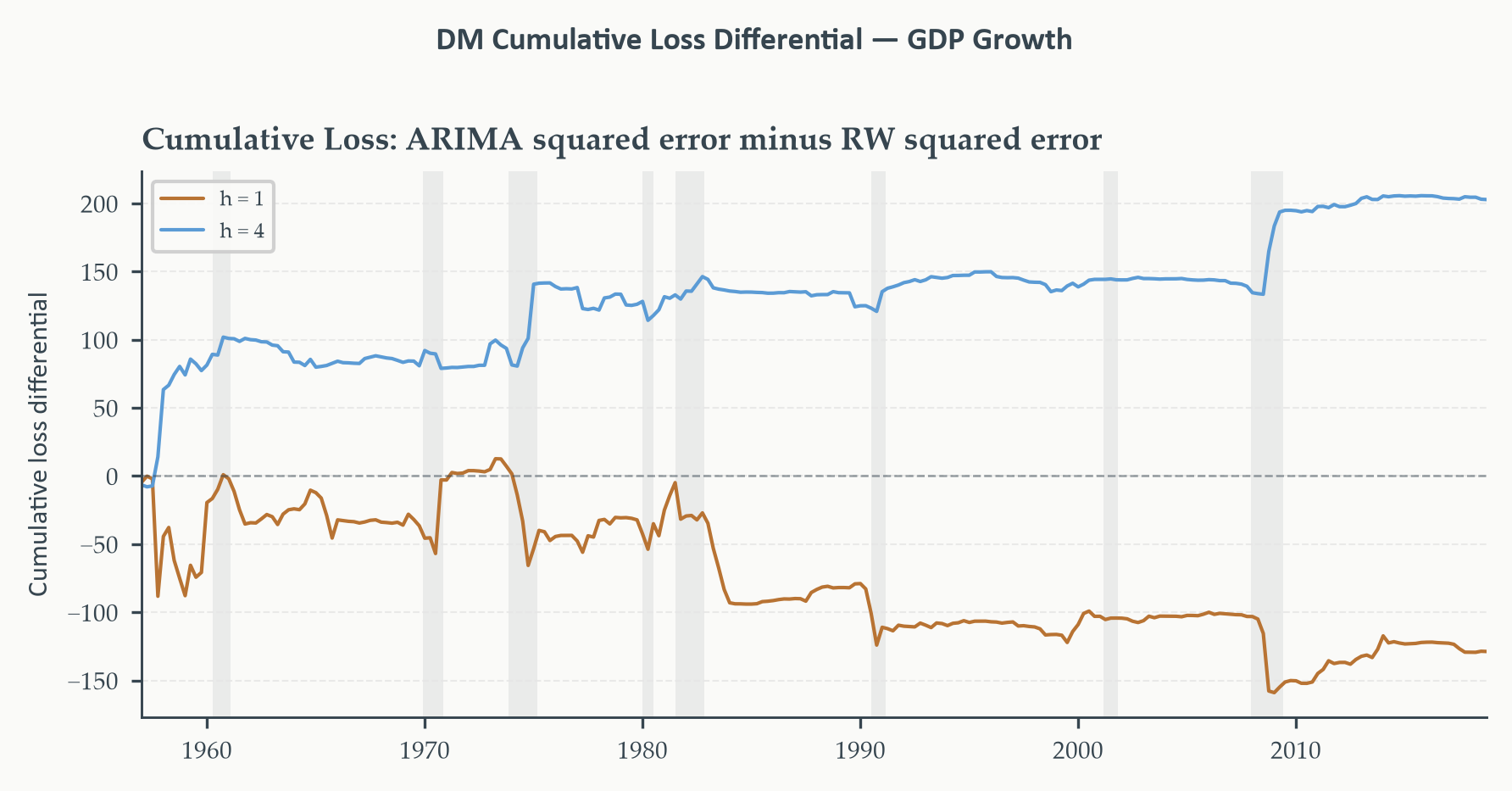
#| fig-cap: "Cumulative loss differential $\\sum_{s \\leq t} d_s$ where
#| $d_t = e_{1,t}^2 - e_{2,t}^2$ (ARIMA squared error minus RW squared
#| error), for $h = 1$ (copper) and $h = 4$ (sky blue). Downward slope
#| means the ARIMA accumulates less squared loss than the random walk;
#| upward slope means the reverse. At $h = 1$ the copper line drifts
#| slightly downward on net, consistent with the negative DM statistic
#| ($-0.803$) but without a clear directional break. At $h = 4$ the sky
#| blue line trends upward, reflecting the random walk's accumulating
#| advantage; recessions (shaded) are the episodes where the gap widens
#| most sharply, suggesting the ARIMA's four-step forecasts struggle
#| particularly around turning points."
#| fig-width: 6
#| fig-height: 3
#| code-fold: true
#| code-summary: "Show code — cumulative loss differential"
fig, ax = plt.subplots(figsize=(6, 3))

for h, color, label in [(H_SHORT, EO_COPPER, "h = 1"),
                        (H_LONG,  EO_SKYBLUE, "h = 4")]:
    _, _, _, d_arr = results_dm[h]
    cum_d = pd.Series(d_arr, index=errors_arima[h].index).cumsum()
    ax.plot(cum_d.index, cum_d.values, color=color, lw=1.0, label=label)

ax.axhline(0, color=EO_CHARCOAL, lw=0.6, ls="--", alpha=0.5)
shade_recessions(ax,
    start=errors_arima[H_SHORT].index[0].strftime("%Y-%m-%d"),
    end=errors_arima[H_SHORT].index[-1].strftime("%Y-%m-%d"))
ax.set_xlim(errors_arima[H_SHORT].index[0],
            errors_arima[H_SHORT].index[-1])
ax.set_ylabel("Cumulative loss differential")
ax.set_title("Cumulative Loss: ARIMA squared error minus RW squared error")
ax.legend(fontsize=6)
eo_style_ax(ax)
eo_suptitle(fig, "DM Cumulative Loss Differential — GDP Growth")
fig.tight_layout()
plt.show()
```
*The DM test fails to reject equal predictive accuracy at both horizons.
At $h = 1$ the ARIMA has a small edge (DM $= -0.803$, $p = 0.422$): the
negative statistic confirms the ARIMA's lower RMSE from the previous section,
but the $p$-value is far from conventional significance thresholds — the
advantage is well within sampling variation. At $h = 4$ the sign reverses
(DM $= 1.802$, $p = 0.072$): the random walk now has lower average loss, and
the $p$-value approaches but does not cross the 5% threshold. The ARIMA's
extra structure is neither clearly beneficial at short horizons nor clearly
harmful at long ones — it is simply indistinguishable from the benchmark by
this test on this sample. The cumulative differential plot gives the temporal
texture behind these averages: look for whether the ARIMA's $h = 1$ advantage
accumulates steadily or is concentrated in particular episodes, and whether
the $h = 4$ reversal reflects a persistent drift upward or a sharp break
around the recessions in the evaluation window.*
## Forecast Combination {#sec-combination}
The DM test in the previous section answers a binary question: does one model
beat another? The natural follow-up is: once we know which model is better,
should we simply use that one and discard the other? The answer, both in
theory and in practice, is often no. Combining the forecasts from multiple
models — even models that differ substantially in accuracy — frequently
produces better out-of-sample performance than using the best individual model
alone. This is the **forecast combination puzzle**, and understanding it is
one of the most practically useful lessons in applied forecasting.
The intuition is portfolio diversification in disguise. An investor who holds
only the single asset with the highest expected return is ignoring the
possibility of idiosyncratic risk — the chance that the best-performing asset
in the past happens to underperform in the future due to circumstances specific
to that asset. Diversifying across assets reduces that risk, even if it
lowers the expected return slightly. The same logic applies to forecasts.
Each model captures some features of the data-generating process and misses
others. A model that does well in stable periods may perform poorly around
turning points; another may do the reverse. Combining their forecasts averages
out their idiosyncratic errors, reducing variance even if it introduces some
bias. The gain from variance reduction typically outweighs the cost of any
bias introduced — particularly when the competing models are not perfectly
correlated in their errors, which is almost always the case.
A second motivation is **model uncertainty**. In practice, we are never sure
which model is the true data-generating process. The DM test tells us which
model performed better in the evaluation window, but we established in the
previous section that this may not tell us which will perform better going
forward. Forecast combination is a way of hedging across models rather than
committing to any single one — analogous to Bayesian model averaging, but
implemented in a simple, robust way that does not require specifying prior
probabilities over the model space.
### Bates-Granger Optimal Weights
The formal framework for forecast combination originates with [Bates and
Granger (1969)](https://link.springer.com/article/10.1057/jors.1969.103), who asked: given two unbiased forecasts $\hat{y}^{(1)}_{t+h|t}$
and $\hat{y}^{(2)}_{t+h|t}$, what linear combination minimises the variance
of the combined forecast error?
The combined forecast is:
$$\hat{y}^{(c)}_{t+h|t} = \omega\,\hat{y}^{(1)}_{t+h|t}
+ (1-\omega)\,\hat{y}^{(2)}_{t+h|t} \tag{5.13}$$
with combination error $e^{(c)}_{t+h|t} = y_{t+h} - \hat{y}^{(c)}_{t+h|t}
= \omega\,e^{(1)}_{t+h|t} + (1-\omega)\,e^{(2)}_{t+h|t}$.
The variance of the combined error is:
$$\text{Var}(e^{(c)}) = \omega^2\,\sigma_1^2
+ (1-\omega)^2\,\sigma_2^2
+ 2\,\omega(1-\omega)\,\sigma_{12} \tag{5.14}$$
where $\sigma_1^2$, $\sigma_2^2$ are the error variances of each model and
$\sigma_{12}$ is their covariance. Minimising over $\omega$ by differentiating
and setting to zero gives the **Bates-Granger optimal weight**:
$$\omega^* = \frac{\sigma_2^2 - \sigma_{12}}
{\sigma_1^2 + \sigma_2^2 - 2\,\sigma_{12}} \tag{5.15}$$
The key insight embedded in this formula is that the optimal weight assigned
to model 1 increases when model 2's variance is high and decreases when
model 1's variance is high — exactly as intuition suggests. But also notice
what happens when $\sigma_{12} = 0$: the formula reduces to
$\omega^* = \sigma_2^2 / (\sigma_1^2 + \sigma_2^2)$, which weights each
model inversely proportional to its variance. More accurate models get more
weight; less accurate models get less. And when both models have identical
variance ($\sigma_1^2 = \sigma_2^2$) with zero covariance, the optimal weight
is exactly $\omega^* = 1/2$ — equal weighting.
In practice, $\sigma_1^2$, $\sigma_2^2$, and $\sigma_{12}$ must be estimated
from the same evaluation sample used to produce the error sequences. This
introduces estimation noise into the combination weights, which can degrade
performance — sometimes badly — when the evaluation window is short. This is
why the simple **equal-weight combination** $\omega = 1/2$ is often
competitive with or even superior to the theoretically optimal weights. The
phenomenon is well-documented enough to have its own name: the **forecast
combination puzzle** is precisely the finding that equal-weight combinations
outperform estimated optimal combinations in many empirical applications,
because equal weighting sidesteps the estimation error in $\omega^*$.
::: {.callout-note icon=false}
## Optimal Combination Weights: The Key Results
For a two-model linear combination
$\hat{y}^{(c)} = \omega\,\hat{y}^{(1)} + (1-\omega)\,\hat{y}^{(2)}$:
**Bates-Granger optimal weight** (minimises combined error variance):
$$\omega^* = \frac{\sigma_2^2 - \sigma_{12}}{\sigma_1^2 + \sigma_2^2 - 2\sigma_{12}}$$
**Equal weights** ($\omega = 1/2$): optimal when $\sigma_1^2 = \sigma_2^2$
and $\sigma_{12} = 0$; robust when estimation noise is a concern.
**OLS combination**: regress $y_{t+h}$ on $\hat{y}^{(1)}_{t+h|t}$ and
$\hat{y}^{(2)}_{t+h|t}$ (with or without an intercept) over the evaluation
sample. Allows for biased individual forecasts and general correlation
structure but uses two degrees of freedom from the evaluation sample.
All three produce unbiased combined forecasts when the individual forecasts
are unbiased and the weights sum to one.
:::
### When to Combine, When to Select
Combination is not always superior. If one model is genuinely much better
than the other — a large, statistically significant DM test, a stable
advantage that does not reverse across subperiods — then selecting the better
model may outperform combination, because the weaker model's errors are
diluted rather than removed. The bias-variance intuition applies here: if the
weaker model introduces consistent directional bias, combining it in will
bias the combined forecast, and the variance reduction may not compensate.
As a rough practical guide: use combination when (i) the DM test fails to
reject, suggesting the models are comparably accurate; (ii) the cumulative
loss differential shows reversals, suggesting their advantages are
regime-dependent; or (iii) the models use fundamentally different information
sets (e.g., one is statistical, one is judgmental). Prefer selection when one
model dominates persistently and by a large margin across all evaluation
subperiods.
### Empirical Application
We form three combined forecasts — equal weights, Bates-Granger optimal
weights estimated from the evaluation sample, and OLS combination — and
compare their RMSE against the two individual models at $h = 1$ and $h = 4$.
```{python}
#| label: tbl-combination
#| code-fold: true
#| code-summary: "Show code — forecast combination"
results_combo = {}

for h in [H_SHORT, H_LONG]:
    e1 = errors_arima[h].values
    e2 = errors_rw[h].values

    # Recover point forecasts: actual = forecast + error, so forecast = actual - error
    fc1 = (errors_arima[h].index.map(
        lambda t: y_growth.iloc[
            y_growth.index.get_loc(t) + h
        ]
    ).values - e1)
    fc2 = (errors_rw[h].index.map(
        lambda t: y_growth.iloc[
            y_growth.index.get_loc(t) + h
        ]
    ).values - e2)
    actual_vals = fc1 + e1   # = fc2 + e2

    # ── Equal weights ─────────────────────────────────────────────────────────
    fc_equal = 0.5 * fc1 + 0.5 * fc2
    e_equal  = actual_vals - fc_equal

    # ── Bates-Granger optimal weights ────────────────────────────────────────
    s1  = np.var(e1, ddof=1)
    s2  = np.var(e2, ddof=1)
    s12 = np.cov(e1, e2)[0, 1]
    denom = s1 + s2 - 2 * s12
    if abs(denom) < 1e-12:
        w_bg = 0.5
    else:
        w_bg = np.clip((s2 - s12) / denom, 0, 1)
    fc_bg = w_bg * fc1 + (1 - w_bg) * fc2
    e_bg  = actual_vals - fc_bg

    # ── OLS combination ───────────────────────────────────────────────────────
    X_ols  = np.column_stack([np.ones(len(fc1)), fc1, fc2])
    b_ols  = np.linalg.lstsq(X_ols, actual_vals, rcond=None)[0]
    fc_ols = X_ols @ b_ols
    e_ols  = actual_vals - fc_ols

    results_combo[h] = {
        "ARIMA":         (e1,      None),
        "RW":            (e2,      None),
        "Equal weights": (e_equal, None),
        f"BG (ω={w_bg:.2f})": (e_bg, None),
        "OLS combo":     (e_ols,   b_ols),
    }

# ── Print comparison table ────────────────────────────────────────────────────
for h in [H_SHORT, H_LONG]:
    print(f"\nh = {h} quarter{'s' if h > 1 else ''}")
    print("═" * 52)
    print(f"{'Model':25}  {'RMSE':>8}  {'vs RW':>8}")
    print("─" * 52)
    rw_rmse = np.sqrt(np.mean(errors_rw[h].values**2))
    for label, (e_arr, _) in results_combo[h].items():
        r = np.sqrt(np.mean(e_arr**2))
        print(f"{label:25}  {r:>8.3f}  {r/rw_rmse:>8.3f}")
    print("═" * 52)
    print("RMSE in annualised pp. 'vs RW' ratio: < 1 beats random walk.")
```
*The results divide cleanly by horizon. At $h = 1$, the ARIMA just beats the
random walk (RMSE ratio 0.978), every combination strategy beats both
individual models, and the best single strategy is OLS combination (ratio
0.953). The Bates-Granger weight of $\omega = 0.65$ confirms that the ARIMA
earns a majority share — the evaluation sample rates it more accurate — but
not overwhelmingly so, and averaging in the random walk still helps.
At $h = 4$ the picture reverses. The ARIMA now trails the random walk (ratio
1.033): at a one-year horizon, the additional structure in the ARIMA does more
harm than good, likely because the GDP growth process is close to white noise
at that frequency and the estimated AR and MA coefficients are fitting
noise. The Bates-Granger weight collapses to $\omega = 0.00$, which means the
evaluation sample is assigning the ARIMA zero weight — effectively selecting
the random walk outright. Equal-weight combination (ratio 1.011) also fails
to beat the benchmark, because it forces half the weight onto the
underperforming ARIMA. Only OLS combination succeeds (ratio 0.972), and it
does so by estimating that the ARIMA's contribution is negligible and
downweighting it accordingly — achieving through regression what Bates-Granger
achieves through variance minimisation, but with the added flexibility of an
intercept that absorbs any residual bias.
Two broader lessons emerge. First, the relative merits of models can reverse
across horizons: a model that adds value at $h = 1$ may destroy it at $h = 4$.
This is why horizon-specific evaluation is not optional. Second, OLS
combination is consistently the best or near-best strategy across both
horizons — but it earns that position by implicitly selecting or downweighting
the weaker model at each horizon, not by averaging blindly. When one model
clearly dominates, combination converges to selection.*
## Evaluating Prediction Intervals {#sec-intervals}
### Coverage
A point forecast is only one output of a forecasting model. The other —
arguably more important for decision-making — is the prediction interval:
the range within which the outcome is expected to fall with some stated
probability. Chapters 3 and 4 showed how to construct 95% prediction
intervals for ARIMA models, and those fan charts illustrated how the interval
width grows with the forecast horizon. But we have not yet asked the obvious follow-up question:
do those intervals actually contain the outcome 95% of the time?
This is the **coverage** question, and it is the first diagnostic for interval
validity. A 95% prediction interval is a statement that, over many forecast
origins, the true value will fall inside the stated bounds on approximately
95% of occasions. If it falls inside only 80% of the time, the interval is
too narrow — the model is underestimating uncertainty. If it falls inside 99%
of the time, the interval is too wide — the model is being overly cautious,
and the stated bounds carry less information than they appear to.
Checking coverage is straightforward: over the evaluation sample of $n$
forecast origins, count how many times the actual value $y_{t+h}$ fell
inside the stated $100(1-\alpha)\%$ interval
$[\hat{y}^L_{t+h|t},\, \hat{y}^U_{t+h|t}]$, then divide by $n$:
$$\widehat{\text{coverage}} = \frac{1}{n}\sum_{t=T_0}^{T_0+n-1}
\mathbf{1}\!\left\{y_{t+h} \in
\left[\hat{y}^L_{t+h|t},\,\hat{y}^U_{t+h|t}\right]\right\} \tag{5.16}$$
For a well-calibrated model, $\widehat{\text{coverage}}$ should be close to
the nominal level $1 - \alpha$. Systematic shortfall indicates that the
model's prediction intervals are too narrow — the tails of the forecast
distribution are too thin relative to the actual distribution of outcomes.
The interval bounds were stored in the main evaluation loop in Section 5.3,
so checking coverage requires no additional model fitting.
```{python}
#| label: tbl-coverage
#| code-fold: true
#| code-summary: "Show code — interval coverage check"
# Interval bounds were stored in the main evaluation loop (Section 5.3).
# No re-estimation needed here.
alpha_levels = [0.10, 0.05]

print("Empirical coverage of ARIMA(1,1,1)+drift prediction intervals")
print("Pre-COVID rolling evaluation  |  Nominal vs actual coverage")
print("═" * 54)
print(f"{'Interval':>15}  {'Nominal':>10}  {'h = 1':>10}  {'h = 4':>10}")
print("─" * 54)
for a in alpha_levels:
    nominal = 1 - a
    row = []
    for h in [H_SHORT, H_LONG]:
        ci_df  = fc_ci_arima[a][h]
        actual = pd.Series(
            [y_growth.iloc[y_growth.index.get_loc(t) + h]
             for t in ci_df.index],
            index=ci_df.index
        )
        hits = ((actual >= ci_df["lo"]) & (actual <= ci_df["hi"])).mean()
        row.append(hits)
    label = f"{int(nominal*100)}% interval"
    print(f"{label:>15}  {nominal:>10.2f}  {row[0]:>10.3f}  {row[1]:>10.3f}")
print("═" * 54)
print("Values below nominal → intervals too narrow (undercoverage).")
print("Values above nominal → intervals too wide  (overcoverage).")
```
*At $h = 1$ the ARIMA intervals show modest undercoverage: the 90% interval
captures 87.9% of outcomes and the 95% interval captures 93.1%, both somewhat
below their nominal levels. The shortfall is small enough to be tolerable in
most research applications. At $h = 4$ the undercoverage is severe: the 90%
interval captures only 70.6% of outcomes and the 95% interval only 79.4% —
gaps of 19 and 15 percentage points respectively. A stated 95% interval that
contains the outcome barely four times in five is not a 95% interval in any
practical sense. Both shortfalls have the same root cause: the Gaussian
innovation assumption and the absence of time-varying volatility cause the
ARIMA to underestimate uncertainty, and that underestimation compounds with
horizon as the interval widens on the wrong baseline variance. For
applications where interval validity matters — risk management, regulatory
capital, scenario analysis — the four-step intervals from this model should
not be taken at face value.*
### Distributional Calibration
Coverage checks a specific quantile of the forecast distribution — the $\alpha/2$
and $1-\alpha/2$ quantiles that define the stated interval bounds. A deeper
question is whether the **entire predictive distribution** is well-calibrated,
not just its tails. A model could have correct 95% coverage while still
placing too much mass in the centre of the distribution, or producing a
distribution that is shifted relative to the actual outcomes in a systematic
way. Checking only coverage would miss these problems.
The standard tool for assessing full distributional calibration is the
**[probability integral transform (PIT)](https://en.wikipedia.org/wiki/Probability_integral_transform)**. The idea is elegant. If the model's
predictive distribution $F_{t+h|t}(\cdot)$ is correctly specified, then the
probability that the actual outcome falls below the forecast's $p$th quantile
is exactly $p$ — by definition of what it means to have a correct
distribution. Now apply this at the realised outcome: the quantity
$z_t = F_{t+h|t}(y_{t+h})$ is the probability that the predictive
distribution assigns to outcomes at or below the actual value. If the model
is correctly specified, $z_t$ is a draw from a uniform distribution on $[0,1]$
for each forecast origin $t$.
This gives us a practical diagnostic: collect $\{z_t\}_{t=T_0}^{T_0+n-1}$
over the evaluation window and plot a histogram. If the model is well
calibrated, the histogram should look approximately flat — uniform. Systematic
deviations from uniformity reveal specific misspecifications:
- **U-shaped PIT histogram** (too much mass near 0 and 1, too little in the
centre): the predictive distribution is too narrow — it assigns too little
probability to large deviations from the point forecast. The actual outcomes
are surprising the model more often than they should. This is the signature
of underestimated variance, often seen in ARIMA models that ignore
volatility clustering.
- **Hump-shaped PIT histogram** (too much mass near 0.5, too little in the
tails): the predictive distribution is too wide — the model is being overly
uncertain. The actual outcomes cluster more tightly around the point forecast
than the distribution implies.
- **Skewed PIT histogram** (more mass on one side): the predictive
distribution is centred in the wrong place — a systematic bias in the
point forecast shows up here as a shift in the PIT distribution away from
uniformity.
For ARIMA models with Gaussian innovations, computing the PIT is
straightforward: $z_t = \Phi\!\left(\frac{y_{t+h} -
\hat{y}_{t+h|t}}{\hat{\sigma}_{t+h|t}}\right)$, where $\Phi$ is the standard
normal CDF, $\hat{y}_{t+h|t}$ is the point forecast, and $\hat{\sigma}_{t+h|t}$
is the predicted standard deviation of the $h$-step forecast error. Both
quantities were stored in the main evaluation loop and are read directly
here.
```{python}
#| label: fig-pit
#| fig-cap: "Probability integral transform (PIT) histograms for the
#| ARIMA(1,1,1)+drift at $h = 1$ (left) and $h = 4$ (right). The
#| dashed line marks the uniform benchmark (perfect calibration).
#| At $h = 1$ the histogram is roughly flat — modest irregularity
#| but no systematic shape — consistent with the near-nominal 90%
#| and 95% coverage reported in the previous table. At $h = 4$ a
#| pronounced J-shape emerges: heavy mass near both 0 and 1, with
#| a spike concentrated at the upper tail. The right-tail spike
#| indicates the model systematically underforecasts growth at the
#| four-quarter horizon — actual outcomes frequently land in the
#| upper tail of the predictive distribution — consistent with the
#| model anchoring too strongly on the rolling mean and missing
#| the persistence of above-trend expansions."
#| fig-width: 6
#| fig-height: 3
#| code-fold: true
#| code-summary: "Show code — PIT histogram"
# Point forecasts and SEs were stored in the main loop — no re-estimation.
# PIT value: z_t = Φ((actual - forecast_mean) / forecast_se)
pit_vals = {}
for h in [H_SHORT, H_LONG]:
    actual_h = pd.Series(
        [y_growth.iloc[y_growth.index.get_loc(t) + h]
         for t in fc_mean_arima[h].index],
        index=fc_mean_arima[h].index
    )
    std_resid = (actual_h - fc_mean_arima[h]) / fc_se_arima[h]
    z = std_resid.dropna().apply(spnorm.cdf)
    pit_vals[h] = z.values

fig, axes = plt.subplots(1, 2, figsize=(6, 3))
n_bins = 10

for ax, h, title in zip(axes, [H_SHORT, H_LONG],
                         ["h = 1 quarter", "h = 4 quarters"]):
    ax.hist(pit_vals[h], bins=n_bins, density=True,
            color=EO_COPPER, alpha=0.75, edgecolor=PAGE_BG)
    ax.axhline(1.0, color=EO_CHARCOAL, lw=0.8, ls="--",
               alpha=0.7, label="Uniform (ideal)")
    ax.set_xlim(0, 1)
    ax.set_xlabel("PIT value")
    ax.set_ylabel("Density")
    ax.set_title(title)
    ax.legend(fontsize=6)
    eo_style_ax(ax)

eo_suptitle(fig, "PIT Histograms — ARIMA(1,1,1)+drift, GDP Growth")
fig.tight_layout()
plt.show()
```
*The contrast between the two panels is sharp. At $h = 1$ the PIT histogram
is approximately flat — consistent with the coverage table showing only modest
undercoverage — and no single diagnostic shape dominates. The model is
reasonably well calibrated at the one-step horizon, in the sense that the
predictive distribution is not systematically too narrow or too wide. At
$h = 4$ the picture changes entirely. The J-shaped histogram — heavy mass at
the extremes, with the right-tail spike most pronounced — is the signature of
two simultaneous problems: the distribution is too narrow (hence mass at both
ends, matching the severe undercoverage in the table), and the model is
biased toward underpredicting growth (hence the spike at PIT values near 1,
meaning actual outcomes land in the top of the predicted range far more often
than probability theory would permit under a correct specification). Together
these findings suggest that at $h = 4$ the ARIMA is not merely imprecise — it
is systematically miscalibrated in a direction that matters: its intervals are
too narrow and its point forecasts are too low. Both problems are consistent
with the model being estimated on a sample that spans both the volatile
pre-1985 period and the calmer Great Moderation, producing a variance estimate
and a mean growth estimate that misrepresent the later, higher-growth portion
of the evaluation window.*
Beyond the PIT histogram, the **[continuous ranked probability score (CRPS)](https://en.wikipedia.org/wiki/Scoring_rule#Continuous_ranked_probability_score)**
offers a single-number summary of distributional forecast accuracy that
rewards both sharpness (narrow intervals) and calibration (correct
coverage). The CRPS for a single forecast origin is:
$$\text{CRPS}_t = \int_{-\infty}^{\infty}
\left[F_{t+h|t}(y) - \mathbf{1}\{y \geq y_{t+h}\}\right]^2 dy \tag{5.17}$$
Intuitively, the CRPS penalises the gap between the forecast CDF and the
step function that places all mass at the actual outcome, integrated over all
possible values. A model that places a spike exactly at the realised value
gets a CRPS of zero; a diffuse distribution that spreads probability mass
widely gets a high CRPS even if the realised value falls within the
distribution. For Gaussian predictive distributions, the CRPS has a closed
form in terms of the point forecast and forecast standard deviation, making
it straightforward to compute. In this chapter we use the PIT histogram as
the primary calibration diagnostic and note CRPS as the natural extension for
applications — such as energy trading, weather forecasting, and risk
management — where the full predictive distribution is the product of
interest, not just a point forecast or a single interval.
## Looking Ahead {#sec-lookahead5}
This chapter completed the core forecasting workflow. Chapters 3 and 4
showed how to build a model and produce forecasts; this chapter showed how
to know whether those forecasts are worth trusting. The toolkit — loss
functions, rolling evaluation design, the Diebold-Mariano test, forecast
combination, coverage checks, and the PIT — is portable: it applies to any
model class, any loss function, and any series.
The empirical results from this chapter leave an open question that the next
chapter is designed to address. The GDP growth evaluation showed that the
ARIMA's advantage over the random walk disappears at $h = 4$, and the
rolling error plot showed that both models' errors cluster around recessions
in a way that looks structural rather than random. This raises a natural
suspicion: the data-generating process may not be stable over the sample. If
the mean growth rate, the persistence of fluctuations, or the volatility of
shocks changed at some point — as arguments about the Great Moderation and
the post-2008 slowdown suggest — then a single model estimated over the full
sample misrepresents both sub-periods, and the rolling evaluation is picking
up the cost of that misspecification.
**Chapter 6 — Structural Breaks** addresses this directly. The **Chow test**
asks whether two pre-specified subsamples have the same coefficients — the
natural starting point when the break date is known or strongly suspected.
The **Bai-Perron procedure** extends this to the case of unknown break dates,
estimating their number and location endogenously from the data. The
**Zivot-Andrews test** revisits the unit root question in the presence of a
possible break, correcting the ADF test's tendency to confuse a broken trend
with a unit root. Together these tools will allow us to ask, formally, whether
the process generating GDP growth changed after 1984 — and whether accounting
for that change improves forecast accuracy beyond what the models in this
chapter could achieve.
## Key Terms {#sec-keyterms5}
::: {.callout-note icon=false}
## Glossary
**Forecast error** $e_{t+h|t} = y_{t+h} - \hat{y}_{t+h|t}$ — The difference
between the realised value at $t+h$ and the forecast formed at origin $t$.
The double subscript is standard: the index after the bar identifies the
forecast origin; the index before identifies the target period.
**Forecast origin** — The time $t$ at which a forecast is made and the
information set $\mathcal{F}_t$ is closed. Forecast errors at the same origin
but different horizons use the same information; errors at the same horizon
but different origins use different information.
**Forecast horizon** $h$ — The number of periods between the forecast origin
and the target period. Accuracy typically degrades with $h$; results should
always be reported separately by horizon.
**Loss function** $\mathcal{L}(e)$ — The criterion used to penalise forecast
errors. The choice of loss function is substantive: squared error loss implies
the conditional mean is optimal; absolute error loss implies the conditional
median. Different loss functions can rank competing forecasters in different
orders.
**Mean squared error (MSE)** — $n^{-1}\sum e_{t+h|t}^2$. Penalises large
errors disproportionately; the relevant criterion when the cost of errors is
convex in their magnitude.
**Root mean squared error (RMSE)** — $\sqrt{\text{MSE}}$. Returns the loss
to the units of the original series; the standard accuracy metric in
macroeconomic forecast evaluation.
**Mean absolute error (MAE)** — $n^{-1}\sum |e_{t+h|t}|$. Penalises errors
proportionally to their magnitude; more robust to outliers than MSE. Optimal
under absolute error loss.
**Mean absolute scaled error (MASE)** — MAE scaled by the in-sample MAE of
the naïve random walk: $\text{MAE} / \bigl(n^{-1}\sum|y_t - y_{t-1}|\bigr)$.
Scale-free and well-defined for series that cross zero. MASE $< 1$ means the
model beats the naïve benchmark.
**Look-ahead bias** — The inadvertent use of future information in model
construction or evaluation. Takes three forms: direct (model estimated on
full sample, evaluated on a subsample), indirect (model selection using
test-set data), and data-processing (transformations based on the full
sample applied before the train-test split). All forms invalidate the
out-of-sample evaluation.
**Rolling window evaluation** — A pseudo-real-time evaluation scheme in which
the estimation window has fixed length $W$ and advances one period at a time.
Adapts to structural change; loses older data at each step.
**Recursive (expanding window) evaluation** — A pseudo-real-time evaluation
scheme in which the estimation window grows from an initial length $W$ to the
end of the sample. Efficient when the process is stable; slow to adapt when
it shifts.
**Diebold-Mariano (DM) test** — A test of equal unconditional expected loss
between two competing forecast sequences. The test statistic
$\text{DM} = \bar{d} / \sqrt{\widehat{V}(\bar{d})}$ uses a Newey-West
long-run variance to account for serial correlation in the loss differential
$d_t = \mathcal{L}(e_{1,t}) - \mathcal{L}(e_{2,t})$, which is of order
$h - 1$ for $h$-step forecasts. Asymptotically $N(0,1)$ under the null.
**Loss differential** $d_t$ — The per-period difference in loss between two
competing models: $d_t = \mathcal{L}(e_{1,t+h|t}) - \mathcal{L}(e_{2,t+h|t})$.
Positive $d_t$ means model 1 incurred more loss at origin $t$. The DM null
is $\mathbb{E}[d_t] = 0$.
**Long-run variance** — The sum of all autocovariances of a covariance-stationary
process: $\sigma^2_\text{LR} = \sum_{k=-\infty}^{\infty} \gamma(k)$. Appears
in the denominator of the DM statistic because the loss differential is
serially correlated under multi-step forecasting. Estimated with the
Newey-West (Bartlett kernel) estimator.
**Newey-West estimator** — A heteroskedasticity and autocorrelation consistent
(HAC) long-run variance estimator using the Bartlett kernel $w_k = 1 - k/(K+1)$
with bandwidth $K$. Guarantees a positive long-run variance estimate. Standard
choice for DM inference with bandwidth $K = h$.
**Forecast combination** — A linear mixture of competing forecasts:
$\hat{y}^{(c)} = \omega\,\hat{y}^{(1)} + (1-\omega)\,\hat{y}^{(2)}$.
Reduces idiosyncratic forecast error variance through diversification.
Often outperforms any individual model, especially when relative accuracy
is unstable across subperiods.
**Bates-Granger optimal weight** $\omega^*$ — The combination weight that
minimises combined forecast error variance:
$\omega^* = (\sigma_2^2 - \sigma_{12}) / (\sigma_1^2 + \sigma_2^2 - 2\sigma_{12})$.
Assigns more weight to the more accurate model; reduces to equal weighting
when $\sigma_1^2 = \sigma_2^2$ and $\sigma_{12} = 0$.
**Forecast combination puzzle** — The empirical regularity that equal-weight
combinations frequently match or outperform theoretically optimal combinations.
Arises because estimation error in the optimal weights offsets the theoretical
gain from variance minimisation, particularly in small evaluation samples.
**Coverage probability** — The fraction of evaluation periods in which the
actual outcome falls inside the stated prediction interval:
$\widehat{\text{coverage}} = n^{-1}\sum \mathbf{1}\{y_{t+h} \in [\hat{y}^L_{t+h|t}, \hat{y}^U_{t+h|t}]\}$.
Should equal the nominal level $1 - \alpha$ for a well-calibrated model.
Undercoverage (actual $<$ nominal) indicates intervals that are too narrow.
**Probability integral transform (PIT)** — For a correctly specified
predictive CDF $F_{t+h|t}$, the quantity $z_t = F_{t+h|t}(y_{t+h})$ is
uniformly distributed on $[0,1]$. Departures from uniformity in the PIT
histogram diagnose specific miscalibration: U-shaped $\rightarrow$ intervals
too narrow; hump-shaped $\rightarrow$ intervals too wide; skewed
$\rightarrow$ systematic point forecast bias.
**Continuous ranked probability score (CRPS)** — A proper scoring rule for
distributional forecasts: $\text{CRPS}_t = \int [F_{t+h|t}(y) -
\mathbf{1}\{y \geq y_{t+h}\}]^2\,dy$. Rewards both calibration and
sharpness (narrow distributions). Reduces to MAE for degenerate point
forecast distributions.
:::